
To work with raster data, we will be using a few different packages. If you do not have one or more of the packages, you can install them using install.packages(). After installing packages, you can load them using library().
library(dplyr) #For data wrangling
library(terra) #For raster data
library(ggplot2) #For data visualization
library(ggspatial) #For data visualization
Introduction
Rasters are a widely used format to represent spatial data. They are commonly used in various applications including remotely sensed imagery from drones and satellites, land cover classifications, and even environmental variables like temperature. Rasters store information in a grid format, where an area is divided into cells (or pixels) arranged in rows and columns. Each cell in a raster contains a value that represents a specific attribute for that location. The straightforward grid structure of a raster is one of its main advantages. Importantly, each cell in a raster and the information that it contains can be linked to a specific geographic location.
The image on the left below is a vector graphic (formulas define the points and lines). In a raster, the image is represented as a grid composed of cells that are of equal sizes, each storing a single value that corresponds to a specific area on the ground. Notice that in the image with the grid overlaid on the right, some cells contain multiple features. For example, certain cells include both river and grass, while other cells contain parts of the house along with grass. Even cells over the house may include windows and walls within the same cell.

We now take the vector image above on the left and turn it into a raster. Unlike the smooth, continuous lines of a vector, the raster is composed of a grid of cells, giving it the gridded texture you see below. Each cell represents a single value or feature. This means that areas where a cell covers multiple features, such as part river and part grass as we saw above, are now simplified into one feature, for example, grass. Notice in the raster below that the circle-shaped window on the door no longer appear perfectly round. The edges of the river look blocky or squarish because of the underlying grid, and some of the fine detail in the grass has been lost. This happens because the cells simplify the curved and detailed features into discrete squares. The size of these cells (resolution) determines how much detail is preserved. In a raster with smaller cells more detail would be preserved and would more closely resemble the original image.

Two primary raster types are continuous rasters and thematic rasters. Continuous rasters contain values measured on a numeric scale and are helpful for variables such as elevation, temperature, or rainfall that change gradually across space. Thematic rasters represent discrete data, or values that fall into specific categories or classes. For example, a thematic raster might have categories that include land cover types (ex. forest, coastal, urban). Thematic rasters can also use numeric codes to represent classes, such as 1 = forest, 2 = grassland, and 3 = water.
We’ll generate example data to help visualize a continuous raster. To do this, we’ll use the rast() function from the terra package. We’ll revisit this function later in the article when we read in raster data.
#For reproducibility
set.seed(256)

#Create a raster with 5 rows and 5 columns
r <- rast(nrows = 5, ncols = 5,
          xmin = 0, xmax = 5,
          ymin = 0, ymax = 5,
          vals = runif(25, min = 0, max = 10))

#Plot
plot(r)

The raster has a total of 25 cells (5 rows and 5 columns) and each cell measures 1 unit x 1 unit as shown by the x and y axes. The cells take on values ranging from 0 - 10 with warmer colors (yellows) indicating higher values and cooler colors (blues and purples) representing lower values. These values represent the third dimension of the data. Notice the bright yellow cell on the right which is located in the fifth column and second row from the bottom, and takes on a value of approximately 9. Generally, the value of a cell corresponds to the entire area of that cell. However, in some cases the value may represent only the center point of a cell.
Resolution
Understanding spatial resolution is important for determining what features can be detected in a raster. For spatial data, resolution indicates the physical dimensions that each cell represents (i.e. length and width). For example, many types of Landsat data (a satellite data product from NASA) have a spatial resolution of 30 meters. This means that each pixel represents a 30 m × 30 m area on Earth’s surface. Some features, like the Great Lakes, are much larger than 30 meters, while other features, such as individual trees or small buildings, are smaller than a single pixel. If we have a raster with a resolution of 200 m, a small river may be difficult to detect because the width of the river could be smaller than a single pixel. These differences can influence how well certain features can be represented in raster data. A larger spatial resolution means each cell covers a larger area, resulting in a coarser grain and less detail. Conversely, a smaller spatial resolution means each cell represents a smaller area, producing a finer grain and a more detailed representation.
We can compare how different spatial resolutions influence the appearance of a raster by examining a raster from the USGS showing elevation of a mountain. One raster has a 1 m resolution and the other raster has a 30 m resolution:
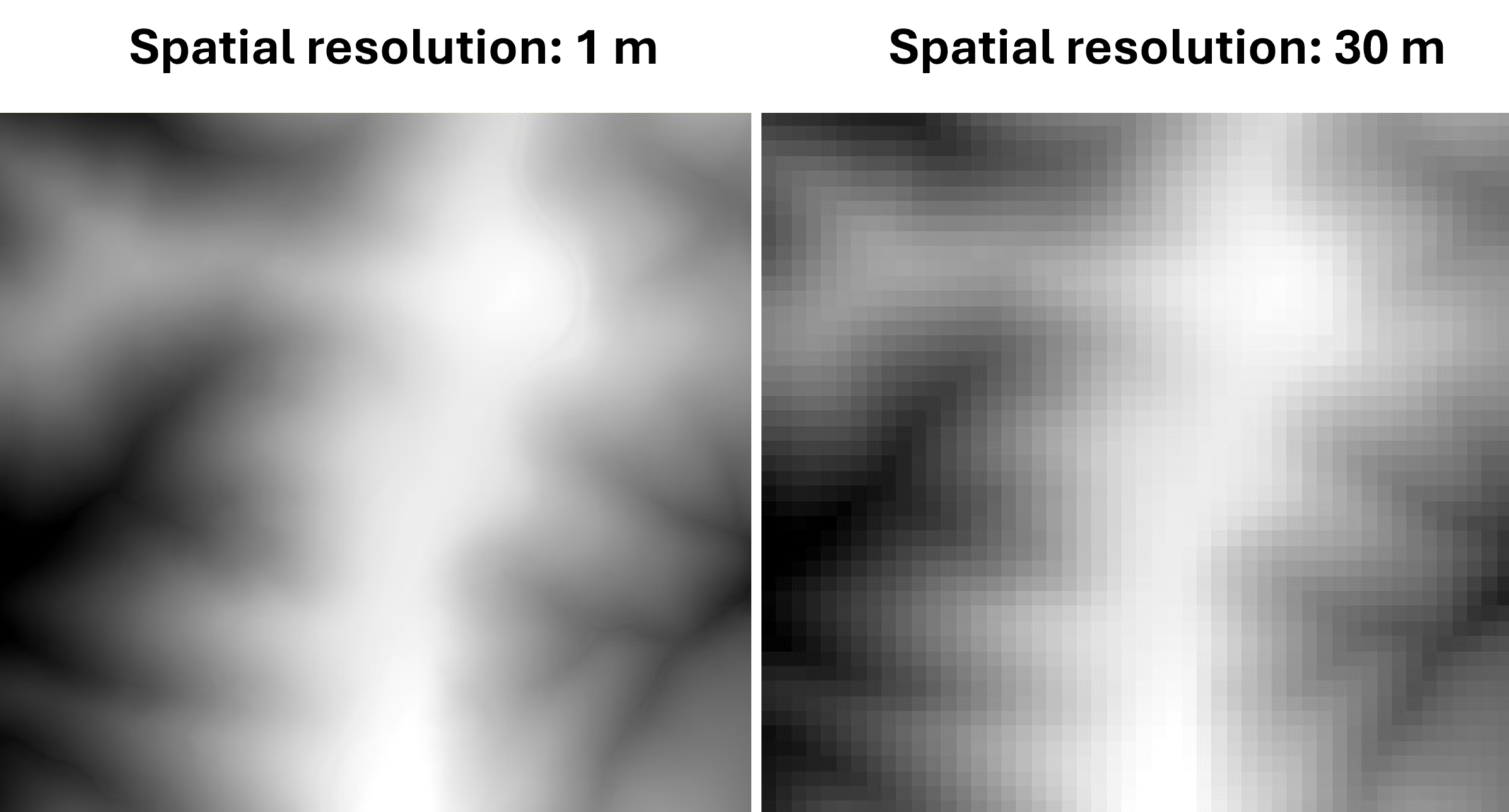
Notice that the raster with the higher resolution (1 m) has more detail compared to the raster with a lower resolution (30 m).
Working with raster data
In this article, we’ll be using a continuous raster (values of the cells are measured on a numeric scale).
We will read in raster data from the National Elevation Dataset (NED) of some mountains off the Blue Ridge Parkway in Virginia. The data is available from the United States Geological Survey TNM Download Manager:
https://apps.nationalmap.gov/downloader/
To access the National Elevation Dataset, you will first need to define an area of interest which, here, defines a geographic region where you want to retrieve data. An easy way to do this is using “extent” which allows you to define your area of interest by drawing a box on the map. Then you can select the data type you want; for this article we used “elevation products (3D Elevation Program Products and Services)”. See the help tab in the application for videos on using the National Map Download Application.
To follow along with this article, you can download the raster data we used from the following link: https://static.lib.virginia.edu/statlab/materials/data/maps_with_raster_data.zip
We will use the function rast() from the terra package to read in the file. Note that the extension for the file is “.tif”, which is a GeoTIFF file and is a type of file that stores raster data. A .tif file is sometimes accompanied by supporting files.
#Read in data
mtn <- rast("ShenandoahClip.tif")

#Plot
plot(mtn, xlab = "Easting", ylab = "Northing")

In a simple plot, we’ve visualized the raster data by displaying each cell’s location along with the corresponding value. Elevation (m) is shown using a color gradient, ranging from below 650 m in lower elevation areas to above 900 m in higher elevation regions. The higher elevation regions are visible in yellow.
The x axis shows Easting and the y axis shows Northing. This uses the Universal Transverse Mercator (UTM) projected coordinate system, which divides the Earth into zones and represents a location (here in meters) east and north of the zone’s origin. This map is in UTM zone 17N. For more information on UTM coordinates see this report by the United States Geological Survey.
The units for the elevation layer are in meters. Some rasters, like the one we created earlier (r), can appear visibly gridded because you can see the individual cells. In this case, we’re looking at a larger geographic area and the raster has a relatively high spatial resolution (each cell is 1 x 1 meter), so the raster appears almost continuous. You may notice a subtle blocky or fuzzy texture around the edges of the mountains, which is a result of the cell-based structure.
Because we are using the terra package, the data is stored as a SpatRaster object, with dimensions representing rows × columns × layers. The raster has 1405 rows, 1515 columns, and a single layer representing elevation values for each cell.
str(mtn)
S4 class 'SpatRaster' [package "terra"]
dim(mtn)
[1] 1405 1515 1
Importantly, you should always be aware of the coordinate reference system (CRS) and units of the data you are working with. The coordinate reference system provides information on how the data are displayed. This information should be provided in the metadata of the raster you are using. You can also check the coordinate reference system directly in R:
crs(mtn, describe=T)
                  name authority  code area         extent
1 NAD83 / UTM zone 17N      EPSG 26917 <NA> NA, NA, NA, NA
This output tells us that the coordinate reference system is NAD83 / UTM zone 17N with an EPSG (unique identifier for commonly used codes) of 26917. We can see that the UTM zone is 17N and the datum is NAD83. Calling crs(mtn) without the argument describe=T will return more detailed information about the coordinate reference system.
If a different coordinate reference system is needed, a raster can be reprojected. This process adjusts the raster’s grid to match the coordinate reference system it is being changed to, and it is often necessary if you have multiple layers with different coordinate reference systems. Here, we will reproject mtn to a geographic coordinate system with latitude and longitude.
We will use project() to change the CRS to the commonly used WGS84 (EPSG: 4326).
#Project to 4326
mtn_4326 <- project(mtn, "EPSG:4326")

#Check crs
crs(mtn_4326, describe = TRUE)
    name authority code  area             extent
1 WGS 84      EPSG 4326 World -180, 180, -90, 90
We now plot mtn_4326 to show the coordinates.
#Plot
plot(mtn_4326)

The reprojected plot now shows coordinates using latitude and longitude defined by the WGS84 coordinate reference system. For more information on coordinate reference systems, see this Earth Lab lesson.
We can pull the extent of the raster, or the geographic area that it covers, by calling:
ext(mtn)
SpatExtent : 694218.722501277, 695733.428808389, 4224311.4201772, 4225716.18153177 (xmin, xmax, ymin, ymax)
A major advantage of working with raster data is that you can do mathematical calculations with it. In the mtn raster, each of the pixels contains a value for elevation in meters. If we want the elevation in kilometers, we can take each cell and divide it by 1000.
#Get elevation in km
mtn.km <- mtn / 1000

plot(mtn.km)

The legend has changed by a factor of 1000 and the units are now in kilometers.
Just like we can do math with a single raster, we can also do math with two different rasters. Suppose we have elevation data for the same area in 1900 and again in 2015. We can subtract the elevation in 1900 from the elevation in 2015 for each cell to get a new raster showing how much the elevation changed between these two time points at each location. Positive values would mean the land got higher and negative values would mean the land got lower. This is a great way to visualize changes across a landscape. We won’t demonstrate adding or subtracting rasters here, but as an example, you can use a simple arithmetic operation like: r.dif = r2 - r1 to get the difference between two rasters.
Making maps with raster data
As we’ve seen, rasters offer a great way to store and visualize data. Raster data can be used for research, making detailed maps, or exploring creative ways to display spatial patterns. For example, you might want to make a map of part of Virginia’s Blue Ridge because it’s your favorite drive. With R, it’s easy to generate and customize rasters into a map and highlight these features.
We will continue working with the terra package. Please note that these maps are designed for creative visualization purposes rather than detailed spatial analysis.
We will use the Everglades color palette from the NatParksPalettes package to define shades of green of blue.
#Load National Parks color palette and reverse direction
library(NatParksPalettes)

#Get Everglades color palette
everglades_cols <- natparks.pals("Everglades", n=30, type="continuous",
                                     direction = c(-1))

#Plot
plot(mtn, main = "Blue Ridge Parkway",
     col = everglades_cols,
     axes = TRUE,
     legend = FALSE)

You can also experiment with different color palettes and use continuous or discrete options.
For even more control with data visualization of the map, we can turn the raster into a data frame and plot it with ggplot2. In the data frame, we will have over 200,000 rows! The data frame will contain the position of a cell (x and y) and the elevation for that cell (i.e. elevation for a given location). The position or coordinates of the cells are included by adding the argument xy = TRUE in the as.data.frame() function.
#Make mtn into a data frame
mtn.df <- mtn %>% as.data.frame(xy = TRUE) %>%

  #rename elevation column
  rename("elevation_m" = "ShenandoahClip")

#View first 3 rows
head(mtn.df, n=3)
         x       y elevation_m
1 694219.2 4225716    710.6562
2 694220.2 4225716    710.7009
3 694221.2 4225716    710.6553
We could take mtn.df and use it in ggplot2, but so far we have used color to indicate areas of higher elevation making the map still appear flat or two-dimensional. To add a sense of depth to the map, we can calculate aspect and slope, and then apply a hillshade. Slope tells us how steep something is while aspect is the orientation of the slope. Together, these can be used to get hillshade, or a way to visualize terrain. In the function shade(), we’ll set the argument angle to 35 which is the elevation in degrees of the sun.
To calculate aspect and slope we’ll use the function terrain() on our SpatRaster object (mtn) and specify whether we are calculating “aspect” or “slope”. We’ll also define aspect and slope in radians by including the argument unit = "radians". This is required because the shade() function expects a SpatRaster object where both aspect and slope are in radians, not degrees.
We will put the hillshade layer we make in ggplot2 to create a map.
mtn.aspect <- terrain(mtn, "aspect", unit = "radians")

mtn.slope <- terrain(mtn, "slope", unit = "radians")

mtn.hillshade <- shade(mtn.slope, mtn.aspect, angle = 35)
Plot the slope and aspect
#Set plotting area
par(mfrow = c(1, 2))

#Plot slope
plot(mtn.slope, main = "Slope")

#Plot aspect
plot(mtn.aspect, main = "Aspect")

We’ll take our hillshade raster and convert it to a data frame to plot with ggplot2.
#Make data frame from mtn.hillshade
hillshade.df <- as.data.frame(mtn.hillshade, xy = TRUE)
There are many different layers you can add to your map, such as roads, parks, rivers, or points of interest. For this, you’ll need the corresponding data. There is much spatial data freely available online from government, research, open data repositories, or mapping services. Often, this data will be a shapefile or vector format that stores the location, shape (e.g. points, lines, and polygons), and attributes of spatial data.
In this example, we’ll overlay a shapefile of the Blue Ridge Parkway, a road that runs through the Blue Ridge Mountains. This data was downloaded from the National Transportation Dataset (NTD) and is available from the National Map Download Application here. See the help tab in the application for videos on using the National Map Download Application. For more information on working with shapefile data in the sf package, see this StatLab article.
library(sf)

#Get CRS of hillshade.df
hillshade.crs <- st_crs(hillshade.df)

#Read in road shapefile
mtn.roads <- st_read("MtnRoadsClip.shp") %>%

  #transform crs to match mtn.hillshade
  st_transform(crs = st_crs(mtn.hillshade))

#Check that the crs of mtn.roads and mtn.hillshade are the same
st_crs(mtn.roads) == st_crs(mtn.hillshade)
We’ll put the map together in ggplot2 by first adding the hillshade.df with a blue color gradient to represent the Blue Ridge Mountains. We’ll add the mtn.roads layer on top of the elevation data and then include a scale bar and north arrow. You can customize the ggplot object by adding or removing elements, adjusting sizes, changing colors, modifying fonts, and editing text, among other things. For example, we will edit the font to “mono” by calling text = element_text(family = "mono") in theme(). If you’re a Windows user, calling windowsFonts() in your console will return font options already available to you in ggplot2. For Mac or Linux users, the same can be done by calling quartzFonts().
#Plot
ggplot() +

  #Add hillshade.df and set colors
  geom_raster(data = hillshade.df, aes(x = x, y = y, fill = hillshade)) +

  scale_fill_gradientn(colours = c("#1E3A5F", "#355C85",
                                   "#6F93B8", "#CFE4F4")) +

  #Add road shapefile on top of hillshade.df
  geom_sf(data = mtn.roads, color = "gray10", inherit.aes = FALSE) +

  #Add a north arrow
  ggspatial::annotation_north_arrow(
    location = "br",
    style = ggspatial::north_arrow_fancy_orienteering,
    height = unit(0.3, "in"),
    width  = unit(0.5, "in"),
    pad_x = unit(0.1, "in"),
    pad_y = unit(0.2, "in")) +

  #Add a scale bar
  ggspatial::annotation_scale(
    style = "ticks",
    location = "br",
    width_hint = 0.15,
    text_cex = 0.6,
    pad_x = unit(0.1, "in"),
    pad_y = unit(0.02, "in")) +

  #Change labels
  labs(x = "Longitude", y = "Latitude",
       title = "Blue Ridge Parkway") +

  #Edit theme
  theme(text = element_text(family = "mono"),
        panel.border = element_rect(color = "black", fill = NA, linewidth = 0.5),
        plot.title = element_text(face = "bold", hjust = 0.5, size = 16),
        panel.background = element_rect(fill = "white"),
        legend.position = "none")

Conclusion
When working with raster data, it’s also important to consider file size. Raster data can require substantial amounts of storage. The size of a raster file increases as the spatial resolution decreases (smaller cell size and more cells) and with a larger geographic extent. The file size will also increase if there are multiple layers (or bands). Here, we’ve focused on a raster with a single band where only elevation was measured for each cell. Many rasters, however, contain multiple bands, where each cell location has multiple values associated with it. These data sets are often stored as multiple .tif files, with one file per band.
While we’ve focused on spatial data in this article, where each cell had accompanying geographic spatial information, raster data is also widely used for images. Similar to the raster data we’ve explored, these images store information in a grid of cells; each cell contains a value that can represent color or intensity.
There are many operations you can do with raster data that we haven’t covered here. For example, you can crop a raster to focus on a smaller area, reclassify values to group them into new categories, or convert a continuous raster into discrete classes. You can also resample raster data to adjust its resolution; this process often involves increasing cell size. For more information on processing raster data, see the terra documentation. For further plotting options, see the tidyterra package which may be especially useful with large raster objects.
R session details
The analysis was done using the R Statistical language (v4.5.2; R Core Team, 2025) on Windows 11 x64, using the packages NatParksPalettes (v0.2.0), ggspatial (v1.1.10), terra (v1.8.80), sf (v1.0.23), ggplot2 (v4.0.1) and dplyr (v1.1.4).
References
- Blake K (2022). NatParksPalettes: Color Palettes Inspired by National Parks. R package version 0.2.0, https://CRAN.R-project.org/package=NatParksPalettes.
- Dunnington, D (2023). ggspatial: Spatial Data Framework for ggplot2. R package version 1.1.9, https://CRAN.R-project.org/package=ggspatial.
- Hijmans, R (2025). terra: Spatial Data Analysis. R package version 1.8-10, https://CRAN.R-project.org/package=terra.
- Pebesma, E (2018). Simple Features for R: Standardized Support for Spatial Vector Data. The R Journal 10 (1), 439-446, https://doi.org/10.32614/RJ-2018-009
- Pebesma, E., & Bivand, R (2023). Spatial Data Science: With Applications in R. Chapman and Hall/CRC. https://doi.org/10.1201/9780429459016
- R Core Team (2025). R: A Language and Environment for Statistical Computing. R Foundation for Statistical Computing, Vienna, Austria. https://www.R-project.org/.
- Wickham, H (2016). ggplot2: Elegant Graphics for Data Analysis. Springer-Verlag, New York.
- Wickham H, François R, Henry L, Müller K, Vaughan D (2023). dplyr: A Grammar of Data Manipulation. R package version 1.1.4, https://CRAN.R-project.org/package=dplyr.
- U.S. Geological Survey. (n.d.). The National Map Downloader [Web application]. from https://apps.nationalmap.gov/downloader/.
Lauren Brideau
StatLab Associate
University of Virginia Library
December 17, 2025
For questions or clarifications regarding this article, contact statlab@virginia.edu.
View the entire collection of UVA Library StatLab articles, or learn how to cite.