Timeline
Various UX testing methods were conducted over the past few years while redesigning and repurposing the UVA Library website. This included user interviews, focus groups, surveys, card sorting and tree testing methods (UX blog article to learn more: https://library.virginia.edu/user-experience/redesigning-the-library-website). Strong navigation cues were also validated using this approach. As a result, the focus of these A/B testing sessions conducted in October-December 2022 was task completion and aesthetic changes to the website.
Why A/B Testing?
Over the past few years, various prototypes were developed, and research studies conducted. The purpose of this round of testing sessions was to understand users’ opinions, thoughts and concerns about visual changes made since the last prototype used for testing.
Researchers at the UVA Library also wished to verify whether users can still perform key tasks using the redesigned website. These sessions also proved useful for gathering research focus areas for future UX testing.
- A/B testing
A/B testing is a UX research method used to compare one version of a website (Version A) to another (Version B). The two versions could be the current and new versions of a website, or two new prototypes. In this article, we compare the 2018 version of the UVA Library website to the 2023 version. More information on A/B testing can be found here: https://uxmethods.org/method/A-BTesting
How it was done
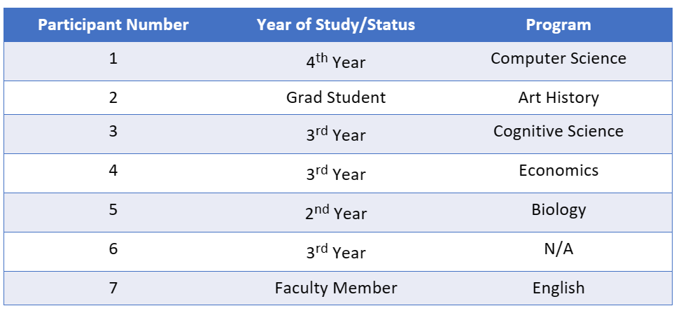
In addition to stakeholder meetings, research sessions were conducted with 7 participants. These sessions included contextual inquiry and direct observation, task analysis, and semi-structured interview questions. Sessions ran for an average of 45-60 minutes.

Contextual Inquiries
Participants were shown UVA Library’s homepage. They were asked to freely navigate the website while narrating their thoughts and concerns out loud. While they explored the website, the researcher quietly observed their interactions, facial expressions, mouse movements and low-level behaviors, which were recorded as field notes.
The Really Cool’s
- Room reservation --- The process of reserving a room was considered straightforward and easy to find by most participants. The Room Reservation button on the Library Hours page was also found to be a convenient affordance.
“Previously I’ve had to go to multiple pages. Now it is very straightforward.”
“I used to Google “Study Rooms in Clemons”. Now I feel like most things you use the website for are there in the main page.”
- Animations on the Equipment and Technology page --- Participants were pleasantly surprised on seeing the icons and animations on the page. While they did not comment on how it improved usability, they appreciated the aesthetic change and “fun” it brought.
“When things move, it makes it more fun!”
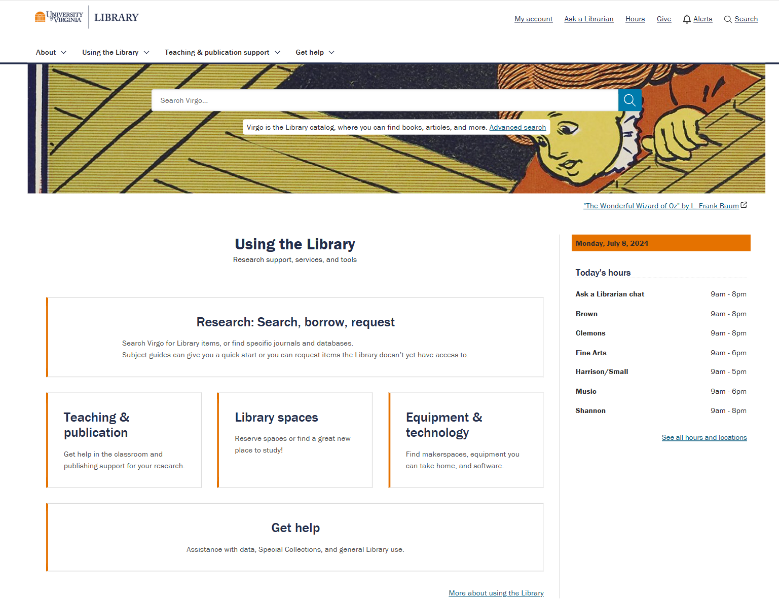
- The banner image --- The banner image used on the homepage received praise multiple times. Participants wished to see more suitable images being used more often and looked forward to seeing the banner image cycling regularly. The source link below the image leading to Virgo was also found to be resourceful.
The Would-Be-Nice-To-Have’s
The following were considered to be elements missing from the website, but did not affect users significantly:
- Documentation explaining Virgo --- Some participants wished to see a section on the website or on Virgo which explained how to use Virgo or how Virgo works. Participants may be unaware of some documentation which exists on “How do I…” tutorials, which could inform a visibility concern.
- Nuanced Virgo searches --- A few participants wanted improved Virgo searches. Specifically, they wished for searches to be more nuanced to reduce the time and effort of scrolling through search results to find what they are looking for. They also seemed to show interest towards Bento searches, a new feature that the library implemented in its website.
“Bento search sounds helpful. Showing different types of results, showing what is physically available vs. online, making keywords more prominent.”
- Personalized Favorites section --- One participant talked about more effective ways to use the website to achieve specific goals. While on the topic, they suggested adding a personalized Favorites section to My Account, which saved pages visited most frequently.
“Like I don’t use My Account now much, but if it could be expanded to also show my most visited pages, like a subject guide, that would be helpful.”
The Do-Not-Like’s
The following were considered elements of the website which were either missing or participants didn’t like, and it affected their experiences negatively:
- Repetitive Navigation Menu --- A few participants found the navigation menu a bit repetitive and redundant.
“I’m seeing the word “help” in a lot of places.”
- Small Software section --- The Software section on the Equipment and Technology page was considered to be too small to warrant its own section, heading and jump-to link.
“Software section is small, and then locations to find software is long. Maybe combine them and change heading?”
- Subject Guides and Databases missing on homepage --- A few participants found it difficult to reach subject guides and databases from the homepage, with one participant failing to accomplish the task and giving up completely. Suggestions were made by participants to add a box on the homepage highlighting subject guides and databases or make current phrasing more visible on the homepage.
“When I think of search, borrow, request, I think of searching for books in the library, not necessarily online. Maybe having something on the homepage, that says Research Databases. Oh, it does say databases, so maybe if I read it, I would have found it. I just saw headings, so I got confused. Maybe highlight the phrase."
Task Analysis
Following the contextual inquiries, participants were asked to complete three tasks, depending on the user group they belonged to. A list of tasks was developed by researchers and designers for participants to complete using the prototype.
The time taken for participants to complete the tasks was also recorded. If participants failed to complete a task, they were informed of the intended path to complete that task. They were then asked to elaborate on why they found the task difficult to perform.
The experience of completing each task was rated positively by most participants, with multiple instances of participants mentioning that elements of the website were:
- Easy to access.
- Easy to find --- “The nice thing is that it was right there.”
- Well-categorized
The overall task completion rate was very high, with a total of 20 out of 21 tasks being completed in a timely manner (Task Completion Rate = 95%).
The Task Completion Time was also found to be high, with an effective time of 5-7 seconds for each task.
Interviews
After the task analysis, participants were then asked a series of semi-structured interview questions. Questions asked included specific elements of the website, such as the color theme, images, icons, labels, navigation, flow, and consistency. A form of Participatory Design was also conducted, asking participants how they would have designed the website differently.
The following are aggregated responses from participants by category:
- Colors, icons, and images --- Opinions on the colors, icons and images used throughout the website was highly positive (most participants rated positively). This was especially evident for the banner image on the homepage, the use of white and light blue color themes, and the animations and icons used on the Equipment and Technology page.
- Labels --- Feedback on the labels used for navigation and hyperlinks throughout the website was fairly positive (around half of the participants rated positively). Navigation was mostly considered to be simple and straightforward. A few participants mentioned wanting an easier way to access subject guides and journals.
- Flow --- Feedback on the flow of their experiences was highly positive (most participants rated positively). Experiences with the website had strong continuity and were not jarring. Webpages were found to have high internal consistency.
Recommendations
The following are recommendations for design, including design decisions which worked well and should not be changed.
- Homepage --- Various aspects of the homepage were received very positively (banner image, box categories, Library Hours, Library Events). These elements do not need any changes.
- Subject Guides and Databases --- A few participants mentioned wanting an easier (or quicker) way to access subject guides and databases, with one participant failing the task to find them. Adding a quicker way to access these elements on the homepage could be a topic of discussion for design changes and improving visibility.
- Categorization of Content --- Most participants felt that the categories worked well and was organized “in a way that made sense”. Revisiting the content and categorization does not seem like a priority.
- Virgo Documentation --- While tutorials on how to use Virgo exists on the website under “How Do I…”, some participant felt that Virgo is too overwhelming. To resolve this, further documentation could be added on the homepage, or existing documentation could be made more visible to users.
- Jump-to Links --- A few participants felt that the jump-to links looked like hanging text before hovering over them. Adding extra signifiers could help users identify the interaction before clicking on it.
Changes Implemented
The following changes were implemented to the website due to the feedback received from the above user research:
- "Search, borrow, request" was changed to "Research: Search, borrow, request", and was center aligned to bring attention to the research materials available in this webpage.
- Content in the navigation boxes was edited to be more concise and efficient to read.

